Redesigning the Onboarding Experience for Trustloop
Redesign of an e-commerce website to improve navigation, increase conversion rates, and enhance the overall shopping experience. The project aimed to create a more visually appealing and user-friendly platform to drive sales and customer satisfaction.
3 weeks
Figma, Notion, Otter.ai
🌍 Background
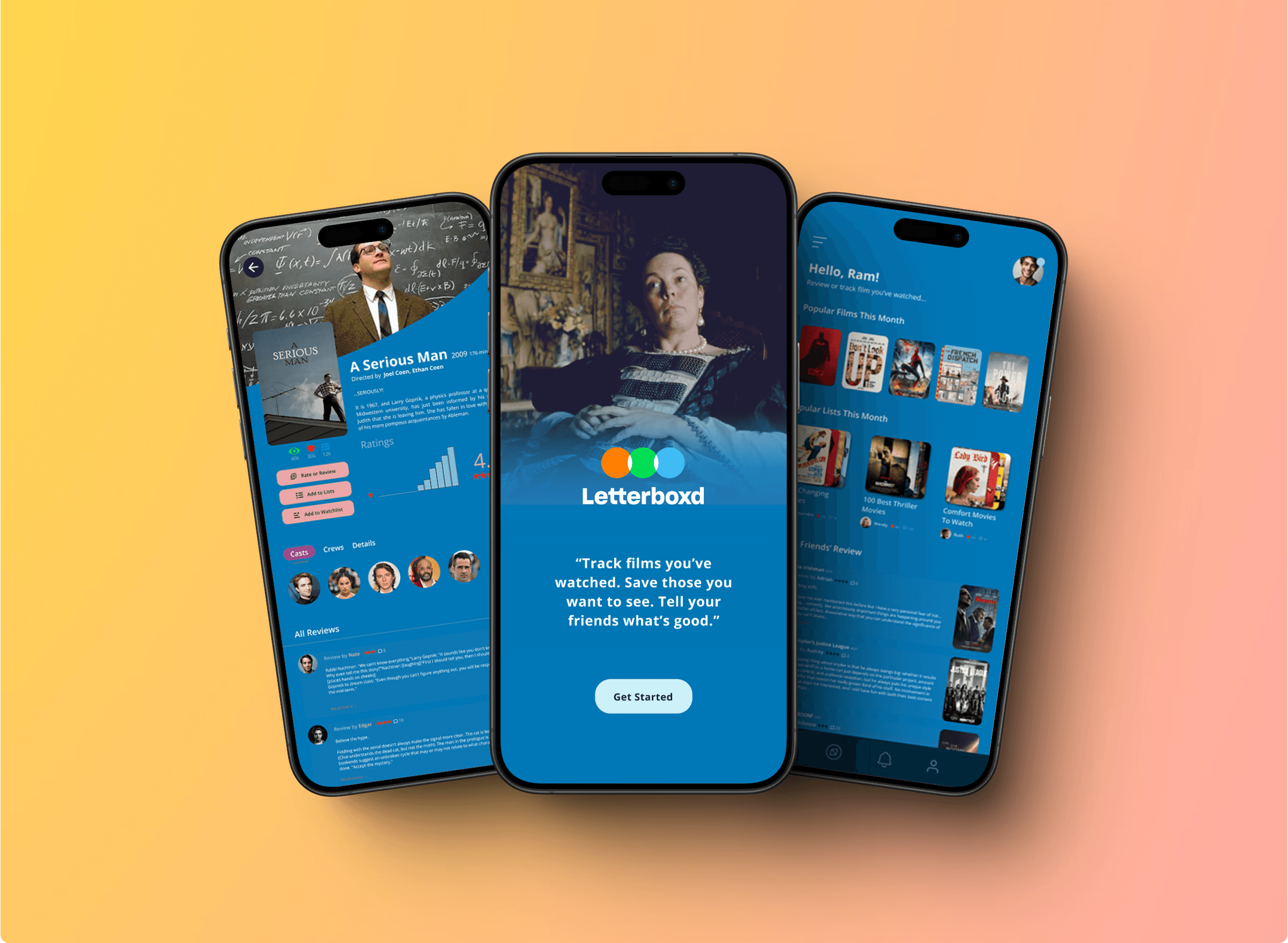
As a movie buff, I often turn to Letterboxd — a social platform for film lovers to log, review, and share their movie-watching experiences. It’s beloved by cinephiles, offering a vibrant community and a massive movie catalog.
But as much as I enjoy the concept, I found myself struggling to use it as a true discovery tool.
• Reviews lacked context or relevance
• The search felt clunky and unhelpful
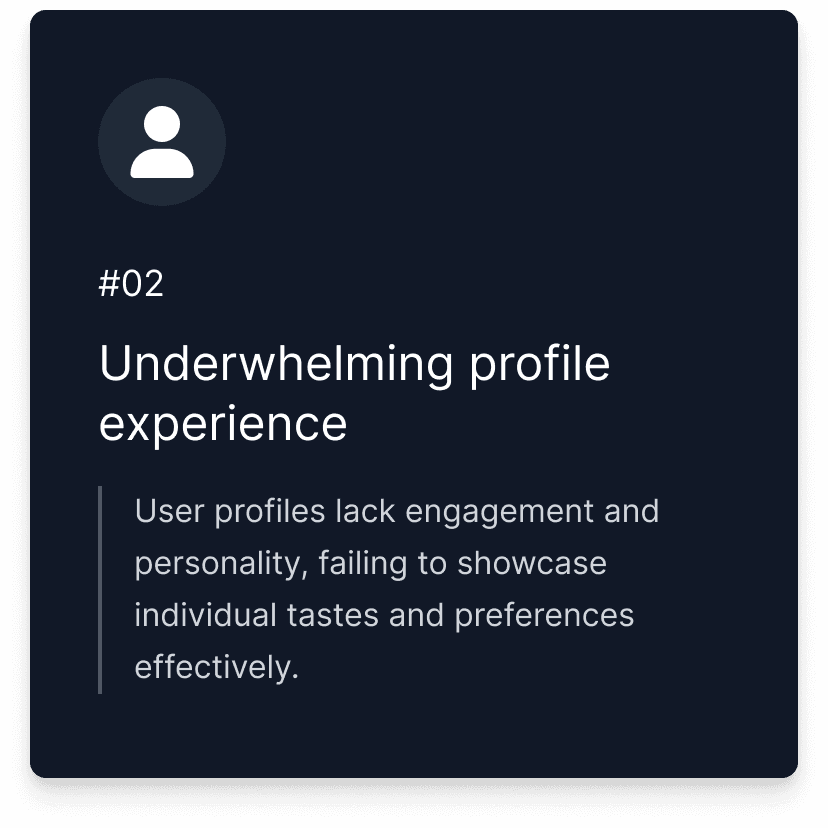
• The profile page was underwhelming and disconnected
• Ads and clutter distracted from the core experience
What if Letterboxd felt more like a trusted film companion — not just a diary, but a smart guide?
So I set out to reimagine how Letterboxd could help users discover and evaluate movies with confidence, clarity, and a personal touch.
Projected Results
30%
Improved movie evaluation clarity
25%
Increase in trust toward recommendations
45%
Increase in discovery feature engagement
As this was a solo project, I planned to measure these projected outcomes using a combination of usability testing and behavioral analytics. To evaluate clarity in movie assessments, I intended to track time-on-task and gather post-task confidence scores during moderated testing sessions. For improvements in profile interaction, I aimed to use simulated clickstream analysis and heatmaps to observe navigation efficiency. To measure trust in recommendations, I planned to run user surveys and analyze engagement signals like review likes or comments. Lastly, I intended to use A/B testing simulations and interaction tracking to assess the impact of newly introduced discovery features such as mood filters and curated lists.


Process
While Letterboxd excels as a social movie logging platform, I noticed gaps in its ability to help users find, trust, and act on recommendations quickly.
As an active user, I experienced frustration with:
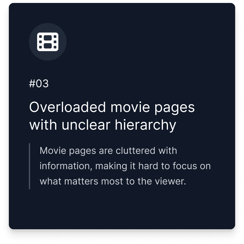
• Cluttered interfaces that buried important information
• Reviews lacking relevance or context
• A profile page that felt more decorative than functional
To ground my assumptions, I conducted qualitative interviews with 3 active users. Their feedback echoed many of my own frustrations and helped me identify three core problems:
This phase helped clarify that the issue wasn’t just visual clutter — it was a deeper lack of clarity, context, and personalized navigation across the app.

This phase helped clarify that the issue wasn’t just visual clutter — it was a deeper lack of clarity, context, and personalized navigation across the app.


“ With our new visual branding and language in place, the new Shopify brand clearly captures the essence of our current and target customer base, our employees, and our values. ”
Tobias Lütke
CEO, Co-founder | Shopify


Conclusion
Revamping the e-commerce website proved to be a game-changer in enhancing user experience and driving sales. By simplifying the navigation and checkout process, we created a more enjoyable shopping experience that significantly boosted conversion rates and customer satisfaction. This project highlights the critical role of UX design in the success of e-commerce platforms.